


We Can’t Breathe Here Either
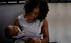
A virus that attacks the lungs has dominated headlines all year. Early in the pandemic, research linked poor air quality to an increased risk of death from COVID-19. But air pollution was killing people before the pandemic — and in greater numbers. 1 in 8 premature deaths globally is caused by air pollution, WHO have reported. This amounts to about 6.5 million premature deaths annually.
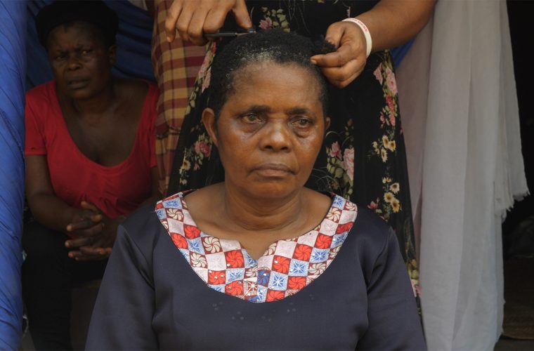
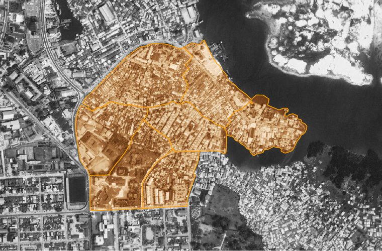
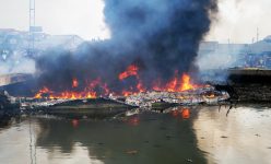
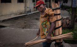
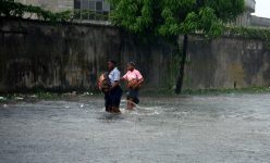
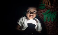
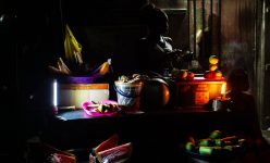
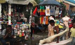
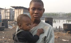
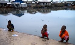
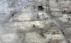
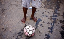
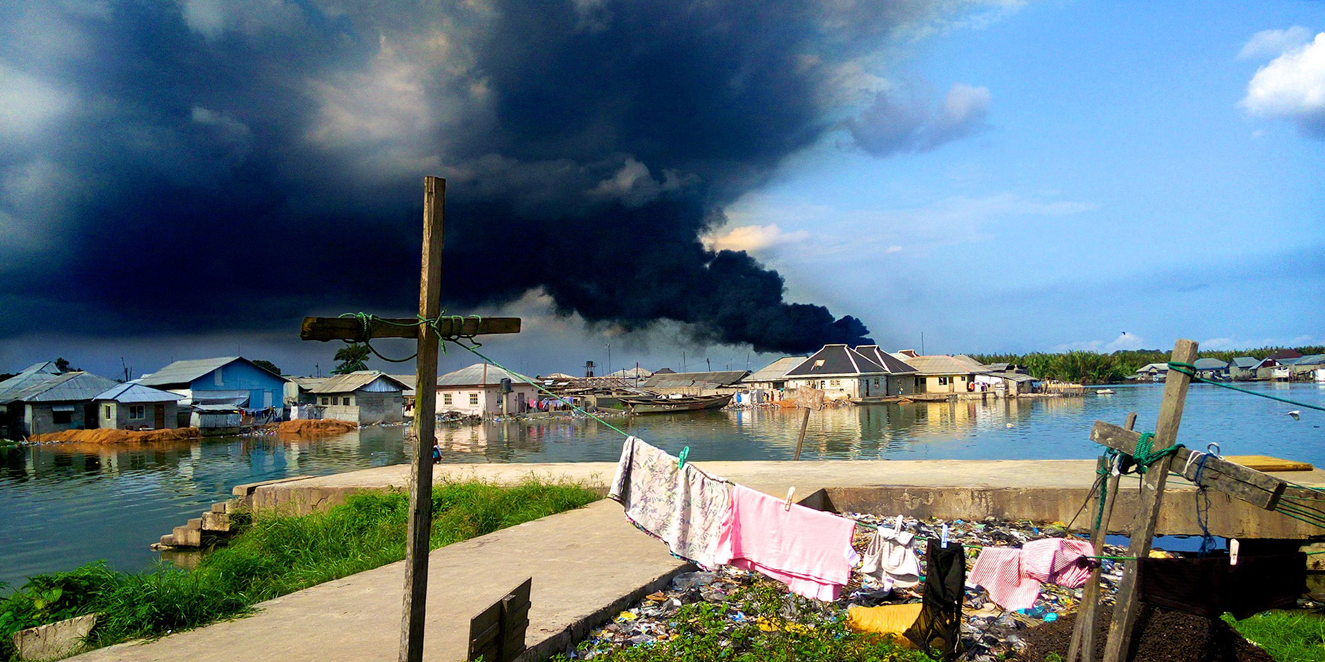
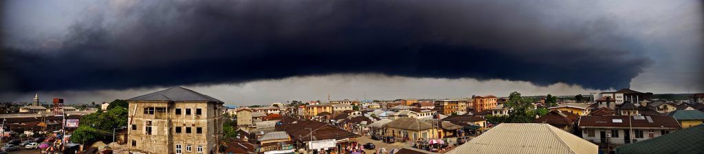
In October 2016, a thick soot settled over Port Harcourt. People woke to find their noses lined with it, dark silt in the corners of their eyes. It settled on surfaces, inside and out. The soles of bare feet were black after taking a few steps; sheets hung out to dry trapped it in their weave; it sat in tight matte black baubles on the surface of puddles and pools. Ours is a city in a region long blighted by large-scale gas flaring, but people all over town were speaking of this soot with novel alarm. At the time, we knew nothing of its source or impacts, and we could say nothing definite about its nature.
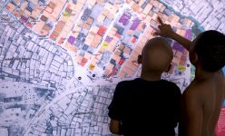
As a group of journalists and community researchers, we wanted to get the data to challenge our assumptions or support our theories. Initial research showed that, despite being declared a ‘pollution emergency’ by the federal government, no comprehensive urban air quality or related health impact studies had been conducted in Nigeria. So we decided to build our own instruments and studies and become air quality citizen scientists.
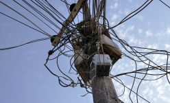
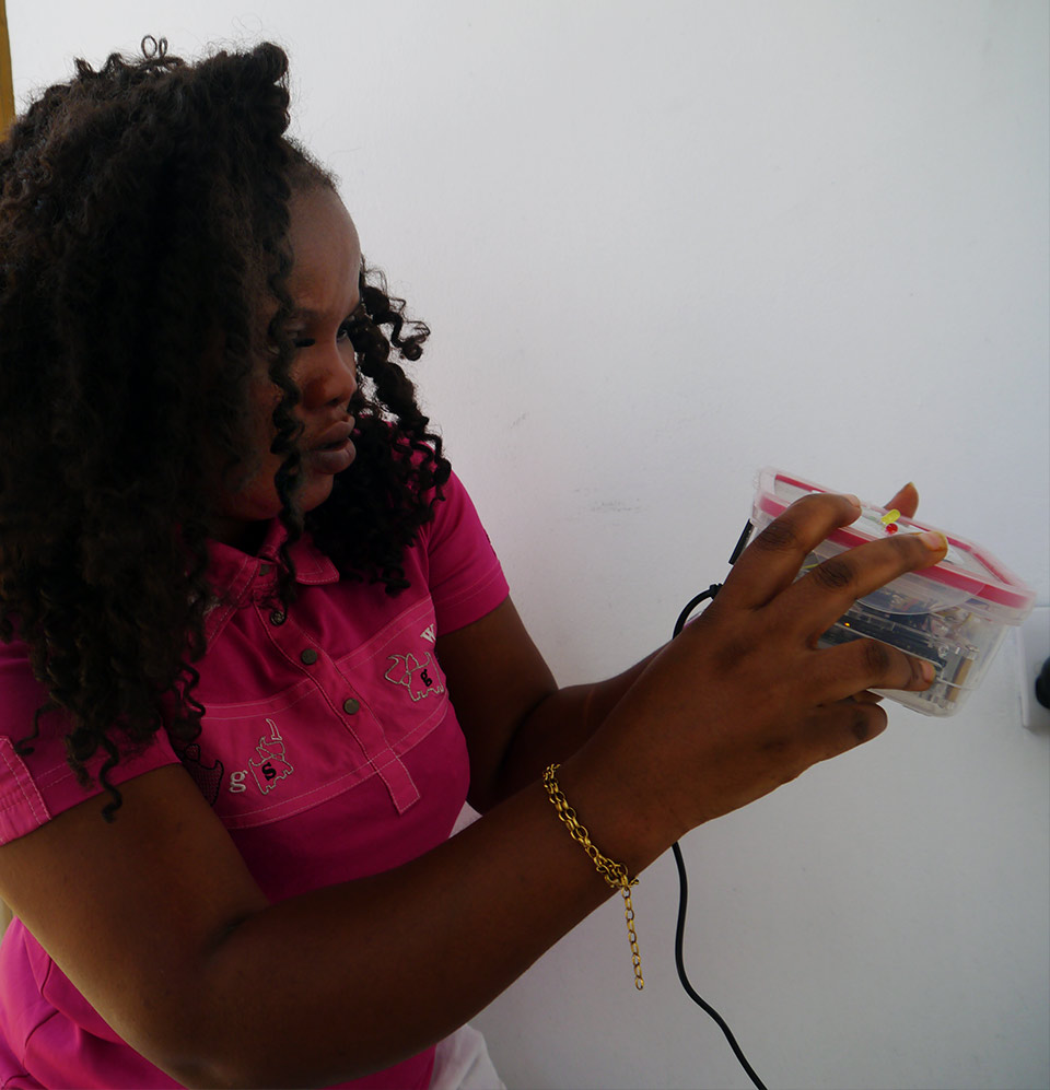
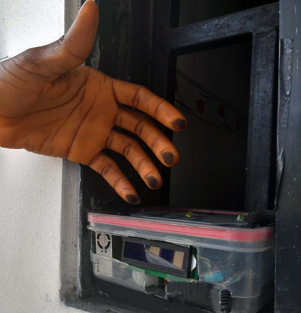
We reached out to our networks. One of our CMAP mentors had a brother living in another city with notoriously bad air pollution: Beijing. He was experimenting with building his own air quality monitors. We enlisted him to build one with us. We had to rethink how to build a monitor that worked for our context, how to power it when our municipal supply was so erratic and how to keep the data flowing over unreliable WiFi networks. We decided to install the DIY monitor at our solar-powered radio studio and to use Bluetooth to ensure our system could reliably and continuously send data to a small computer for storage.
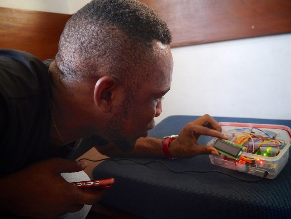
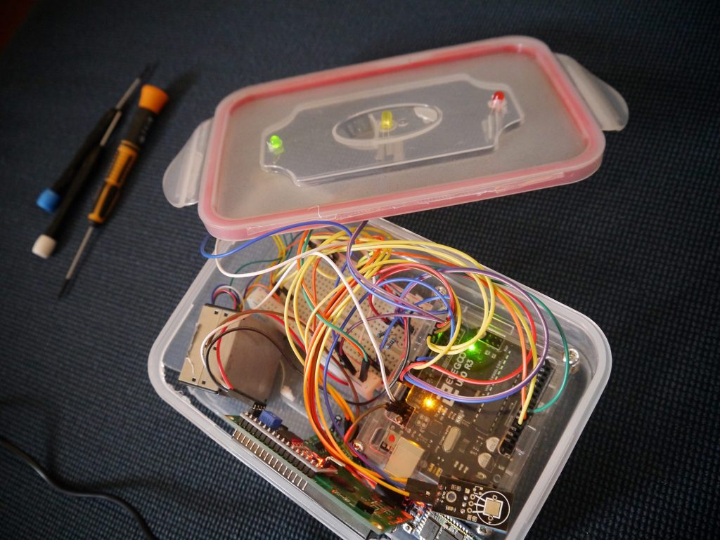
We now have two homemade monitors. While they are not discriminating enough to provide data that can be published or included in WHO statistics, we have been able to use our data to document trends, to test our assumptions and guide our research.
We have consulted with globally recognised air quality experts and have learned that, although we cannot say that the hourly PM2.5 concentration in the air which we record on any given day is accurate, we can meaningfully determine whether air quality falls into the ranges of ‘good’, ‘bad’ or ‘extremely bad’.
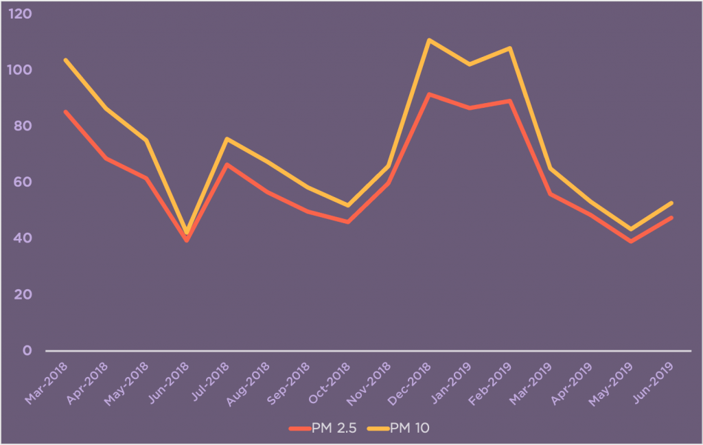
Since we started capturing air quality data in March 2018, we have observed the following trends:
1. Air quality seems to be worse during dry season (November through March) than during rainy season.
This is something we long assumed, but we now have the data to back it up. There is increased media coverage and social media campaigning on the issue through the dry season, too. But focus and resolve tends to get washed away with the rains. It is important for us to understand the seasonal nature of the issue so that we can sustain attention and action.
2. Air quality is much worse at night, but not too bad during the day.
This is contrary to most documented trends of urban air quality studies in other cities. We should also note that one of our monitors is located down in the waterfront, where there is limited vehicle traffic. The night spike in pollution offers clues as to its cause — we speculate on this below.
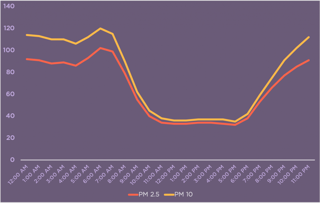
3. There tend to be two spikes of bad air quality — one usually around midnight-1 am and another around 6 am.
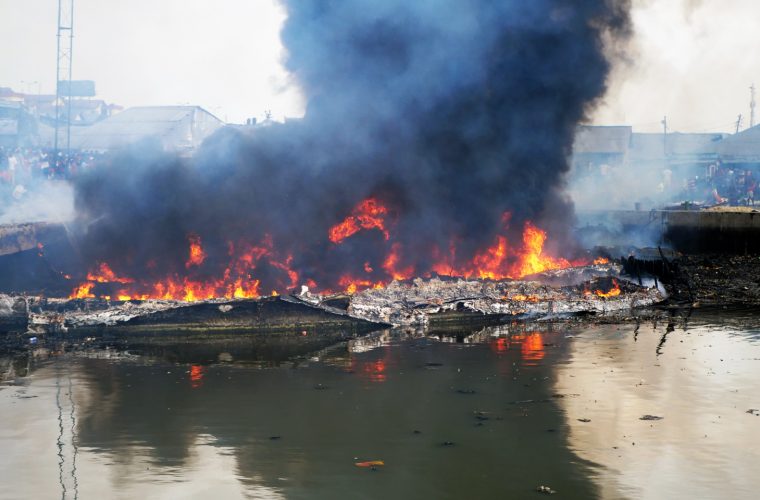
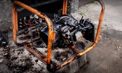
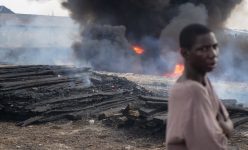
While we cannot conclusively attribute these spikes to a particular cause, there is a strong correlation with the operational schedules of many informal creek refineries that typically run two cycles of refining per night. Without further data and research into other factors, from wind direction to refinery locations, we can only speculate about the significance of this correlation.
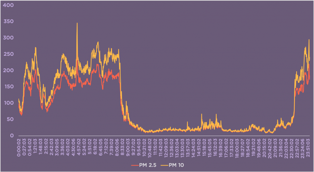
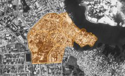
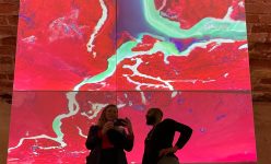
Graphs above – Left: Monthly averages of PM 2.5 and PM 10 levels from March 2018 to June 2019; Right: Hourly averages based on data collected over 16 months from March 2018 to June 2019
We have taken our analysis further and will share findings as soon as we have more rigorous air quality monitoring systems in place. Nevertheless, even though we are drawing on data from only two uncalibrated sensors, and even though we have to be modest about the conclusions we can draw, it is clear that air pollution levels in our neighborhoods (even taking into consideration a wide margin of error) are dangerously far beyond levels WHO determines are acceptable — even on what we call a ‘good air day’. On many nights, our little monitor has a blinking red light indicating that air quality levels are ‘Very Unhealthy’. More often than not, air quality levels rise to ‘Hazardous’, according to the Air Quality Index (AQI) rating system.
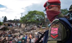
Air quality in Africa is significantly under-researched. This lack of research is surely connected to the continent’s desperately inadequate regulatory frameworks, which has cost lives and will cost more still through the pandemic. Indeed, this lack of oversight is deliberately exploited by international energy traders based in Europe who sell diesel, petrol and kerosene to Nigeria that contains up to 204 times EU permitted PPM. This internationally traded fuel is more polluting than the product refined in illegal creek refineries.
If we can broaden and deepen our data collection and monitoring programme, and support it with more accurate and discriminating instruments, we could begin drawing out a more conclusive picture of air quality in Nigeria’s oil capital. Maybe our little citizen science project could become a living lab for residents and international scientists alike to deepen their understanding of urban air quality in what appears to be a very dire situation. The observations and experiences of everyday people could be backed up by comprehensive data collection as a catalyst for change to improve health and environment in the city.
We were excited when WHO held the first Global Conference on Air Pollution and Health in October 2018, but were surprised when pictures of Port Harcourt children in their uniforms, walking to school through clouds of smoke, were tweeted out by WHO to raise awareness for the conference proceedings. These images featured prominently on the conference website, and still on the WHO website. While we were glad to see Port Harcourt visually represented in global discussions about air pollution, we were disappointed that our city was not recognized in the data-based discussions.
We are not the only ones missing. Only 28 of the over 3,000 cities in the WHO 2018 ambient air quality database are from Sub-Saharan African countries. This begs the question: what do we really know about air quality in the majority of African cities?
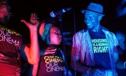
As a group of community journalists, mappers and musicians, we are in a unique position to think holistically about how we can use our data to facilitate change. Chicoco Collective brings together mapping and data collection with a range of advocacy platforms and spaces of creative engagement. You may have even already heard one of our musicians, Osomproduct, mention ‘black soot in the air’ in his powerful pandemic anthem ‘Dark Times’. Moving forward we hope to use our emerging citizen science air quality programme to build a media campaign based on real impacts, to work on informing and educating policy makers and partnering with other campaigns and organisations to build demand for change. Let us know if you are interested in learning more or helping us expand our citizen science project!
Visit Viral Times again soon to see our pollution photo-essay.